Charts and Widgets
-
As
test_user1create a new map and add thene_50m_admin_0_countrieslayer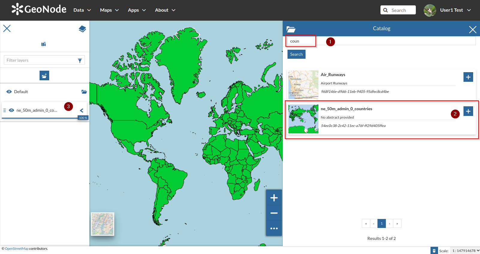
-
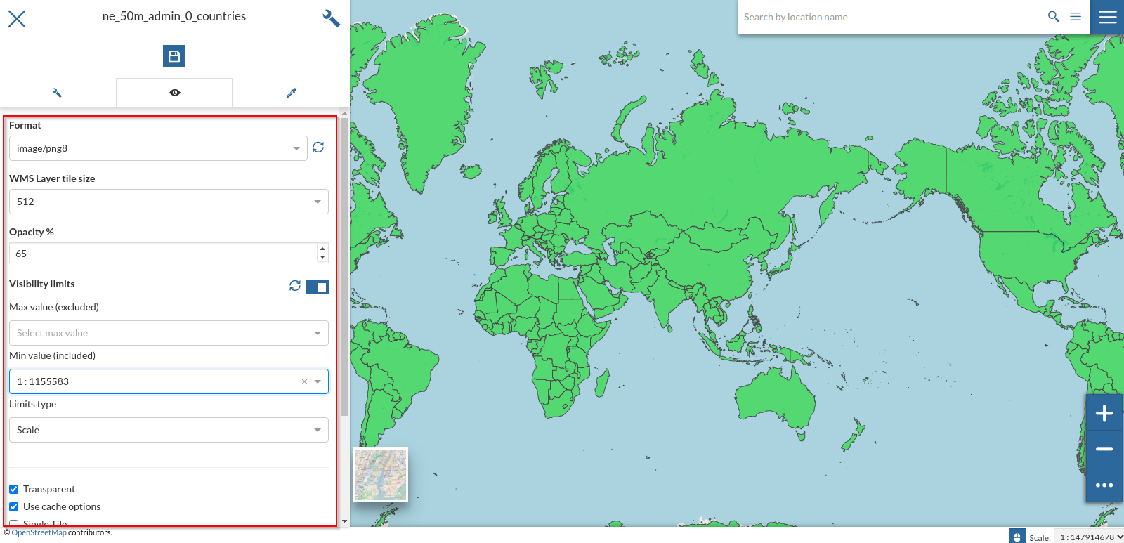
Let’s tweak a bit some settings as we learn from the previous section
-
Let’s also change the style to the
CSSone we created on the previous chapters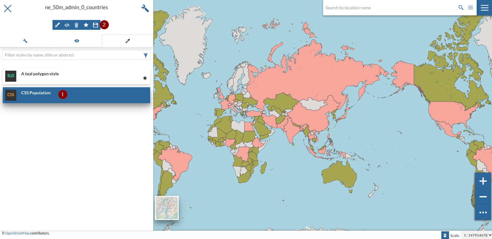
-
Open the
Charts and Widgetwindow and selectTable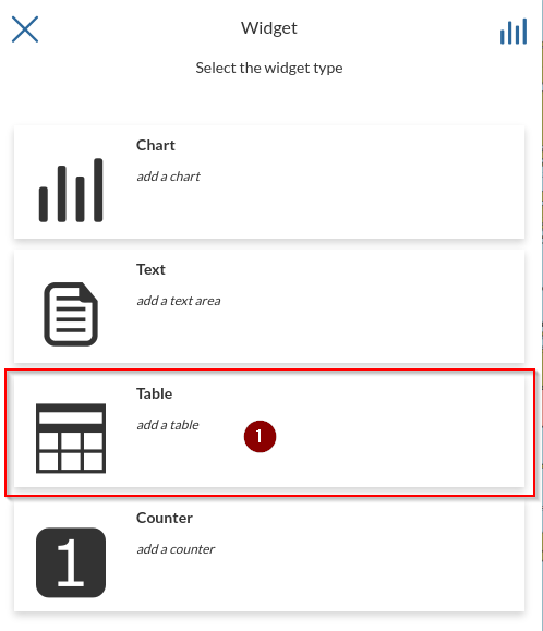
-
Select only the attrbutes
NAMEandISO3and click onNexticon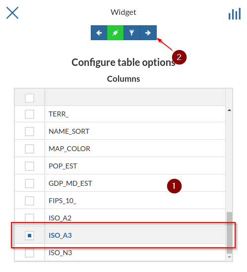
-
Provide some
TitleandDescriptionandSave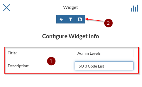
-
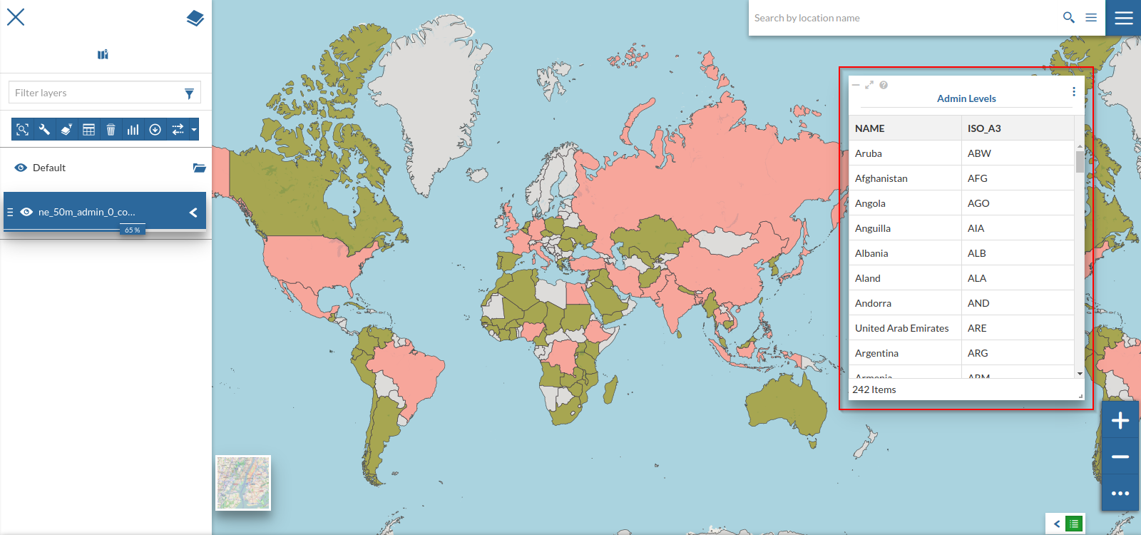
Resize and move the widget where you want on the map; also notice that its contents change accordingly to the geometries present on the viewport
-
To change its contents and make them fixed, despite the zoom level, edit the widget again and uncheck the
Chainicon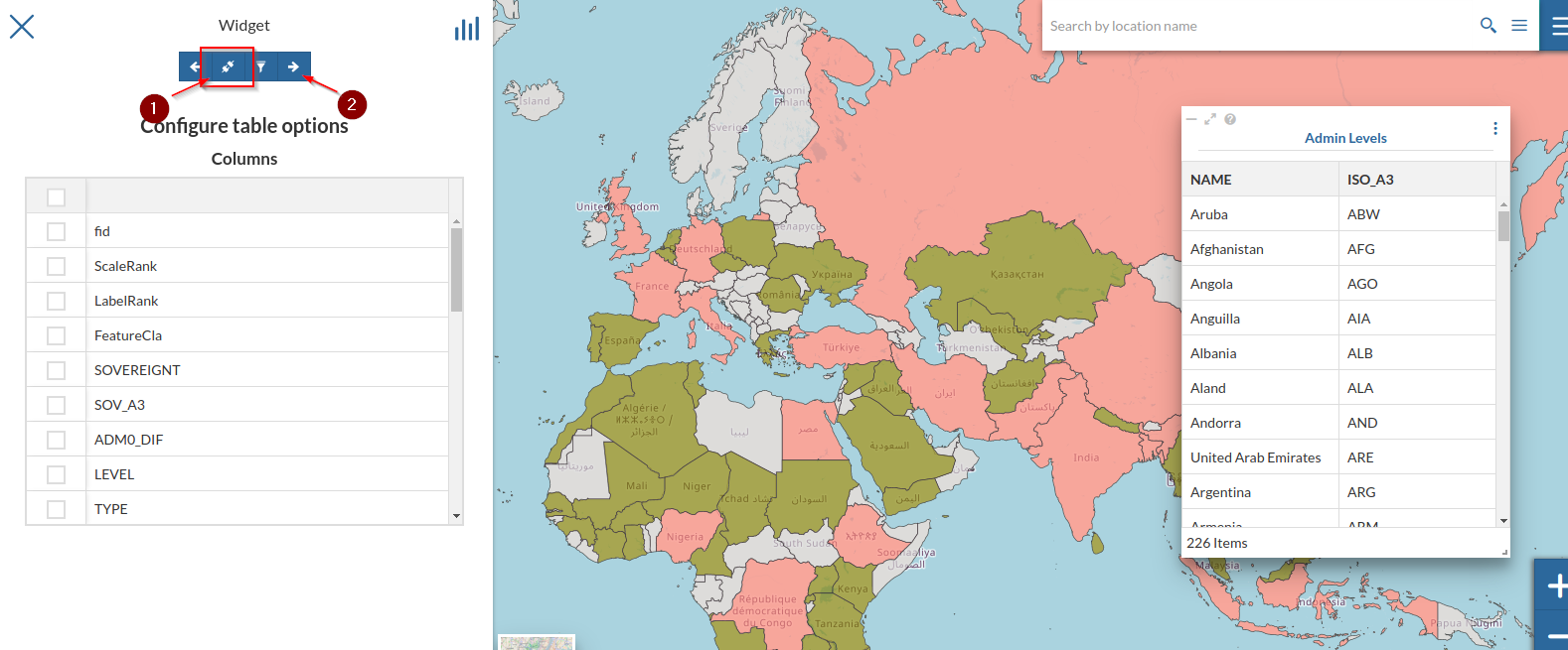
-
Let’s add a
Chartwidget to the map; repeat the steps at point 1 but selectingChart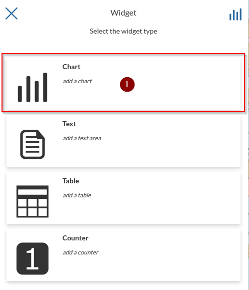
-
Select
ISO3asX Axis,POP_ESTasY Axis,MAXasOperationand, optionally, change the color of the chart; notice the preview changing accordingly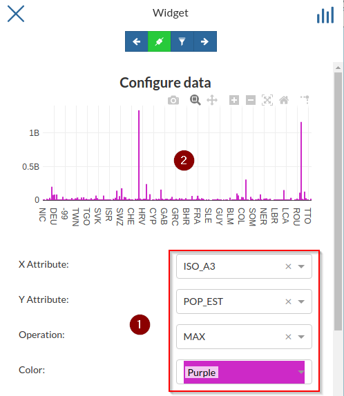
-
Open the
Advanced Options, change theTypetoLOGand notice the scale and preview changing accordingly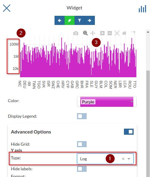
-
Try changing it to
CATEGORYalso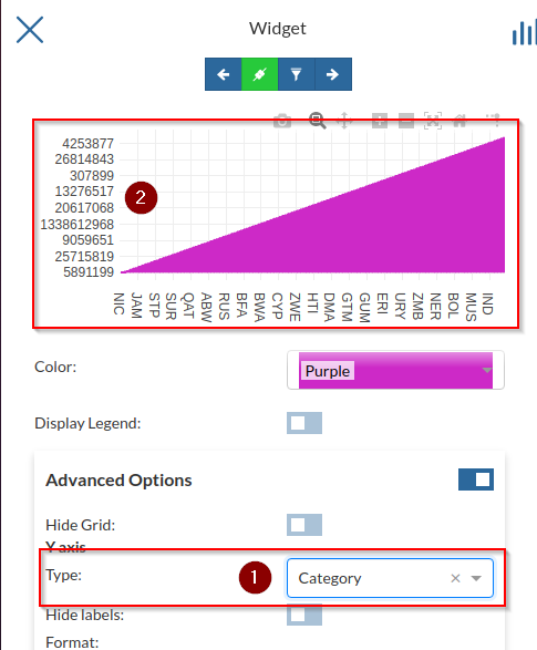
-
Change it back to
LINEAR, optionally add aPrefixandFormat, check the preview and save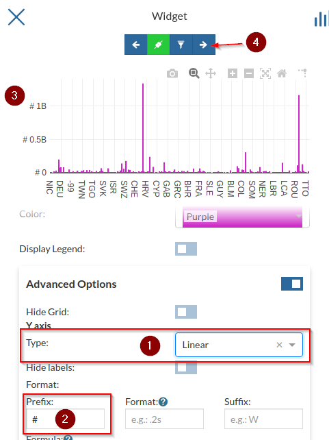
-
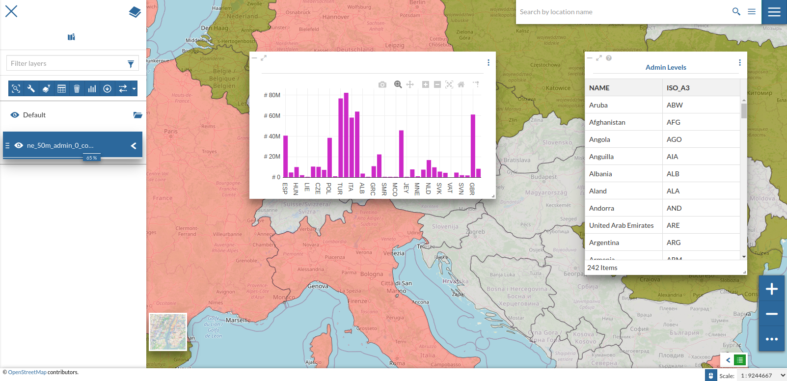
Bind the chart to the map and try zooming on some regions of
Africa; notice the chart adapting accordingly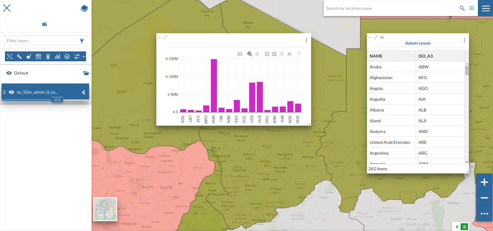
-
Try zooming around over some other continents and see how the chart changes